
Digital Catalogue
The development of an native-app reimagining of the nostalgic physical Book of Dreams, with new curated elements, tailored to each individual’s interests.
From launch to scale - designing for delight and inspiration
Context and challenge
Argos is the UK’s largest retail store in the UK. It is seen as a reliable place to shop for a range of products, from everyday items, to larger value items.
However, since the much loved original physical catalogue (or Book of Dreams) was discontinued in 2021, many customers have asked for it back, whilst surveys indicate that 32% of customers don’t see Argos as a place to buy premium, top quality brands and products.
Users have stated that they would buy from Argos more often if they knew that they sell products from top brands like Apple, Samsung, Sony and more.
The outcome
21% increase in add to wish lists from the new catalogue feature, resulting in 0.9% conversion uplift (£1.1 million annual revenue), 12% increase in AOV (£110 > £123), resulting in greater reach for products and app usage engagement.
Hypothesis
By utilising the nostalgic elements of the old catalogue, and repackaging it into a curated, broadly inspirational native-app experience, brand perception will significantly improve, and AOV and conversion rates will increase.
My role across the project
I led a multidisciplinary team from initial discovery through to implementation, with the goal of creating a delightful and inspirational browsing experience, optimised through new personalisation elements that tailors new results to each individual’s habits and interests.
I moved between hands-on UX design, cross-functional collaboration with branding, contact centre teams, engineering teams and executive stakeholders to influence the product and prioritisation decisions.
3 phases of development
Phase 1 - Onboarding and entry points
Create onboarding experiences for returning and new users that utilise Argos mascots (Trevor and Connie) to showcase the Digital Catalogue features coming soon.
Phase 2 - Optimisations
Enhance journey flow, adding new tokens, elements and components to design system, collaborating UX copywriter team to create an editorial tone of voice.
Phase 3 - Personalised deals and offers / Gamification
Promote new drops, re-releases and price drops tailored to each user. Gamification elements to promote retention and repeat visits.
Discovery
Frequent feedback from in-store colleagues and contact centre agents demonstrated a strong appetite from customers to have the old physical catalogue back.
Customers would typically use the catalogue to search for products that they necessarily didn’t know they wanted or were immediately ready to purchase.
Customers would typically circle items or “dog-tag” pages and return to them at a later date to refine their choices before making a purchasing decision.
The catalogue would typically be used for idle browsing, such as birthdays or christmas, or idle browsing.
If a user wanted to purchase something immediately, they would typically have an idea already what they wanted and would either search for it directly on the website, or go in-store to pay and collect immediately.
Some customers have complained about the catalogue being far too broad and difficult to browse with too much choice.
The catalogue was great for inspiration as it focused more on product imagery and themes, with less focus on features and pricing. This meant many users would shortlist higher value items and make a decision later on what one to purchase.
Since the catalogue was discontinued, 32% of customers do not see Argos as a place to buy premium products or brands.
Methods used: Focus groups, existing insights, analytics, user surveys
Competitor Analysis
Competitor analysis was undertaken to understand how other players in the market offer a personalised, inspirational experience. I looked at a wide range of industries, including clothing, furniture and toys. The brands audited were Etsy, Asos, Ikea, Zara, Ebay, Temu, Shein, River Island, H&M, Wayfair, B&Q, Nike, Pinterest, New Look.
Competitor analysis surfaced repeat patterns in inspirational content:
-
More editorial, playful copy
-
Larger, lifestyle imagery with stripped back product card details
-
Video content and text overlayed over images
-
Styling/sets and supplementary recommendations
-
Personalised deals and offers
-
Dynamic product card sizes
-
Unique interactional elements that differ to the rest of the app journey
Workshopping
-
I led multiple workshops with a multidisciplinary team (UX, engineering, product managers and marketing managers) to map the current decision-making journey, and pain points.
-
I conducted a prioritisation matrix in workshops to understand constraints and synthesise pain points.
-
The workshop helped to understand data we already have on users vs what we don’t know, and what APIs are needed to expand the digital catalogue.
-
Dot voted on a capability matrix to prioritise based on impact vs effort. This shaped MVP vs fast follows.
-
Conducted user surveys with customers to understand how they interacted with the old physical catalogue and what they miss most about it.


Ideation
Out with the old, in with the new
Collaboration with the marketing team meant that we could fully tap into the Argos brand and showcase the evolution of the catalogue, from manual circling of products to a sleek and quick native experience that allows users to add items to their wish list
Trevor at the heart of everything
The onboarding video utilises Trevor, our official mascot, to strengthen the Argos brand. This will be useful in future iterations when we begin to integrate the AI personal assistant “Ask Trevor” more directly into the app.
Editorial language
I worked closely with marketing and a UX copywriter on the tone of voice across the entire digital catalogue to ensure that an editorial language that was commonly seen throughout the old physical catalogue was woven through the entire experience. Playful, confident, and unmistakably Argos.

Storyboard of onboarding video

Final UI of onboarding video
A wider uplift of the homepage UI
COLLABORATING WITH CMS
I led a redesign of the content blocks that sit on the top of the homepage of the Argos app homepage. This area is owned by the CMS team, so I presented data to show that this would be the best area for customers as only 42% of customers scroll past trending for you. This uplift would also bring trending for you above the fold
An A/B test was created with both versions, with option B showing more interaction with trending for you sections and no impact on click through rates or conversion on CMS content blocks.
The new solution has had a delay in deployment due to constraints in building new components and capabilities. The MVP is a single widget below the trending for you section on the homage.
The next phase will utilise widgets with text separated from the image, whilst the final UI redesign inputs live text on top of the asset to give a more modern look and feel. This will also unlock capabilities to incorporate video content within the block, which means we can show the onboarding video for the Digital Catalogue from within the homepage.

Option A - Controlled variant

Option B - Proposed solution
Mapping the end-to-end journey
KEY ACTIVITIES
I mapped out all journeys within the Digital Catalogue, including gifting specific missions, adding to wish list, and entry points. I then conducted an open card sorting exercise with 100 participants to understand content hierarchy within the Digital Catalogue, following by a closed card sorting exercise once sub-pages had been defined. Hi-fidelity prototyping was undertaken of the end to end journey to take into user testing and validate functionality and appetite for use.

Initial sketch of end-to-end journey
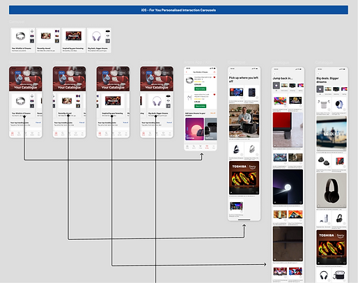
Hi-fidelity end-to-end journey
Haptic elements that create wonder
-
Users noted in user surveys that they typically circle items or “dog-tag” pages to save a product they want to look at later.
-
I looked at ways we can recreate this nostalgic element through micro-animations and haptic feedback.
-
I created an animation that sees products become outlined upon tap, whilst also introducing vibration on tapping the favourite button.
-
The user is then able to add the item directly into a catalogue-specific wish list, or move it to another wish list.

USER FEEDBACK
-
User testing saw most participants express “delight” and “nostalgia” with the micro-animations.
-
Satisfaction scores amongst participants scored “highly satisfied”.
-
Participants enjoyed having the ability to move items into different wish lists as it meant they had more control over wish list bucket bulding.
USER VERBATIM
-
“I like the outline, it makes me feel like it’s done something, like it’s gone somewhere directly”
-
“The little animation is very nice, it looks very modern”
-
“I know exactly what’s happened, so I don’t feel lost at all”
-
“I wasn’t expecting to see anything appear, so that’s a nice touch. It definitely reminds me of circling items with a pen”


%202.png)


Outcomes and results
+21%
Increase in Add to Wishlist from Catalogue
------------------------------------------------------------------------
Argos app users tend to be more loyal and have naturally higher conversion rates than desktop/mobile customers. Higher click through to conversion means more chance of conversion.
72%
Customer CSAT scores
------------------------------------------------------------------------
User testing outcomes scored “Highly satisfied” for nostalgia and delight, with users noting greater sense of inspiration and intuitiveness.
+0.9%
Conversion uplift within the app
------------------------------------------------------------------------
0.9% conversion has increased annual revenue by £1.1 million.
+12%
AOV uplift from Catalogue
------------------------------------------------------------------------
Average app AOV £110, DC has seen AOV increase to £123.
*Survey conducted with 30 users post-launch
OBSERVATIONS
-
Entry points are the biggest area of improvement for optimisation. Currently only 8% of users are using the Digital Catalogue.
-
Engagement remains strong for those that do use it, with add to wishlist and conversion rates showing significant improvement.
-
We likely won’t see a significant rise in usage until we unlock the capabilities to make entry points more prominent throughout the app.
USER VERBATIM
-
“It’s helped me find stuff that I didn’t even know Argos sold”
-
“It’s nice that the stuff it’s showing me is stuff I would typicallly look for”
-
The videos are nice. I would stop to watch the videos as that tells me more about the item than normal photos”
-
“I would definitely explore this more to see what else I can find in here”
The wider impacts
INSPIRATION BREEDS RETENTION
-------------------------------------------------------------------------------------------------------
Users noted a greater sense of inspiration, and a likelihood to keep returning back to the app to keep looking at newly released products. This will increase our loyal userbase.
AVERAGE TIME ON THE APP HAS INCREASED
-------------------------------------------------------------------------------------------------------
Users spend an average of 83 seconds on the digital catalogue, whereas the average time spent from landing > trolley is 61 seconds. This means that the catalogue is capturing people’s attention and encouraging them to explore products.
REACH FOR PRODUCTS HAS INCREASED
-------------------------------------------------------------------------------------------------------
21% increase in users clicking through to PDP from within the catalogue. This means users are finding items of interest quicker than having to go through the typical browse and search journey.
FULL AI-INTEGRATION HAS BEGUN
-------------------------------------------------------------------------------------------------------
New engineers were onboarded to maximise capabilities to launch the Digital Catalogue. A new start up squad has subsequently been created to begin fully integrating AI (Ask Trevor) natively into the app.
STAKEHOLDER CONFIDENCE IN DESIGN-LED DECISIONS
-------------------------------------------------------------------------------------------------------
The prioritisation matrix has become a repeatable tool which has led everyone from Product through to commercial stakeholders feel included and aligned. This has reduced redesigns and re-reviews, and led to greater investment into the app to meet Argos’ app-first strategy.